
What Is a Color Wheel?
Simply put, a color wheel is a circle diagram that illustrates the relationships between different colors.

PRIMARY COLORS
primary colors are the foundational colors from which all other colors are mixed. In other words, you don’t mix any colors to get red, yellow, or blue, they simply are what they are.
SECONDARY COLORS
Purple, green, and orange. The secondary colors are made by mixing two primary colors together. For example, red and yellow combined to make orange. You can see that each secondary color is located directly in between the two primary colors that make it up.
TERTIARY COLORS
They’re made by mixing a primary color and a secondary color together. These colors can sometimes be referred to by their own unique names, for example, the combination of blue and green can sometimes be called teal.
ANALOGOUS COLORS
Simply put, analogous colors are ones that are similar in temperature and are found close to each other and sometimes directly adjacent on the color wheel. For example, everything from yellow-orange to red-orange is analogous to yellow because all of those colors feature some amount of yellow in them.
COMPLEMENTARY COLORS
The other important color relationship is that of complementary colors. In simplest terms, any two colors that are directly across from one another on the color wheel are considered complementary. Because of this distance apart from one another on the color wheel, complementary colors have the highest amount of contrast possible. Some examples of complementary colors include red and green, yellow and purple, and blue and orange.
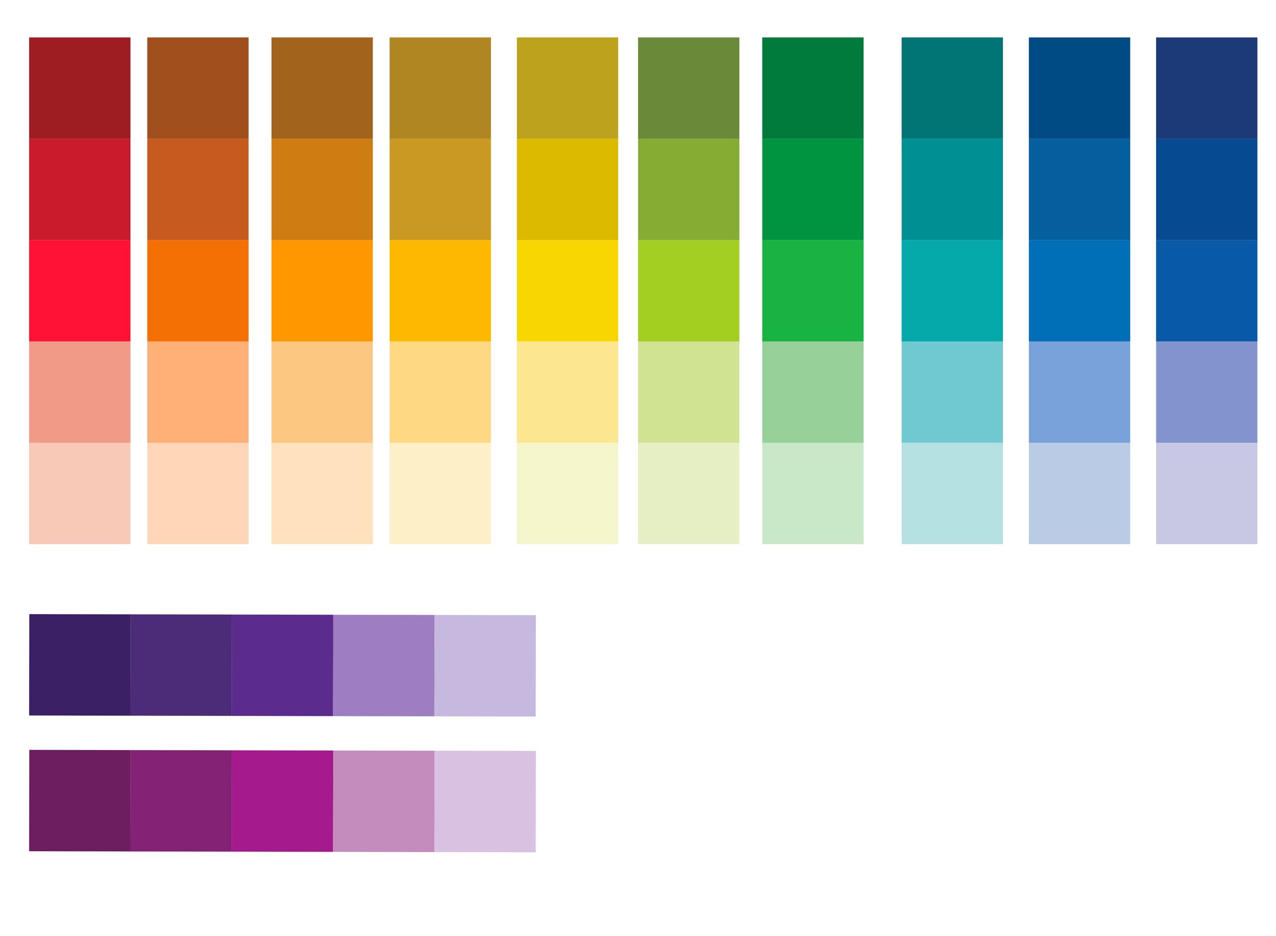
MONOCHROMATIC
Monochromatic colors are all the colors (tones, tints and shades) of a single hue. Monochromatic color schemes are derived from a single base hue and extended using its shades, tones and tints. Tints are achieved by adding white and shades and tones are achieved by adding a darker color, grey or black. Check out the examples of monochromatic colors in the picture to the right.

Neutral colors are not typically found on the color wheel. They include black, white, grays and browns (some would say shades of blue and green are often included). Neutral colors are sometimes referred to as “earth tones” due to the fact they are colors you’re most likely to find in water, dirt, clay, rocks, sand, land/sky etc.


When in doubt, go neutral! It’s not only easy but it always has a “clean” look to your photos. Don’t be afraid to add in different patterns or textures though! They add dimension to your images.

WHAT ARE JEWEL TONE COLORS?
A personal favorite of mine, jewel tone colors are richly saturated hues named for gems including sapphire blue, ruby red, amethyst purple, citrine yellow, and emerald green. This palette is a contrast of intense colors you can wear with neutrals or color-blocked to beam brightly against the stark backdrop of fall and winter to spark the perfect color storm.
Jewel tones are the ultimate guide to dressing fashionably in fall and winter months. Wear one or wear them all - you can never go wrong!
.MAKING SENSE OF IT ALL.
While this seems like a lot to keep track of, It’s really only a few guidelines and they’re based on simple concepts. Don’t worry about remembering what analogous means, just remember the color scheme. When experimenting with different variations start with a neutral base and go from there. When adding accent colors stick to accessories to help ease you into a more colorful look.
Here are a few examples to help show you how these color schemes can be implemented:

NEUTRAL COLOR SCHEME
BASE COLORS: CHARCOAL
ACCENT COLORS: GRAY, BROWN, CREAM

ANALOGOUS COLOR SCHEME
BASE COLORS: RED AND ORANGE
ACCENT COLORS: RED AND ORANGE

TRIADIC COLOR SCHEME
BASE COLORS: NAVY
ACCENT COLORS: RED AND YELLOW
In summation, pick one color as the base, use one or two as the accent (complimentary, triadic, analogous) and allow neutral colors and/or tints or shades of your foundation color (monochromatic) to keep it all together. Dressing an entire family takes a lot of effort, planning and patience so please do not hesitate to ask me for advice or help. I would love to be of any assistance, after all, its my job!
A TIP: DO NOT FORGET TO CONSIDER YOUR BACKGROUND
For example, if your intentions are to stand out from your background you might plan a “Complimentary” color scheme. Wearing shades of red (or colors close to red) in a green field would be complimentary (opposite colors on the color wheel). If you love the idea of blending into your background without any one or more particular colors sticking out for a smooth, subtle look you may go with a “Monochromatic” color scheme. An example of this would be wearing shades of blue at the beach to blend with the sea. Consider you background and feel free to look up ideas to see what you like.